
Introduction: The Death of Grey and the Birth of Grounded Soul
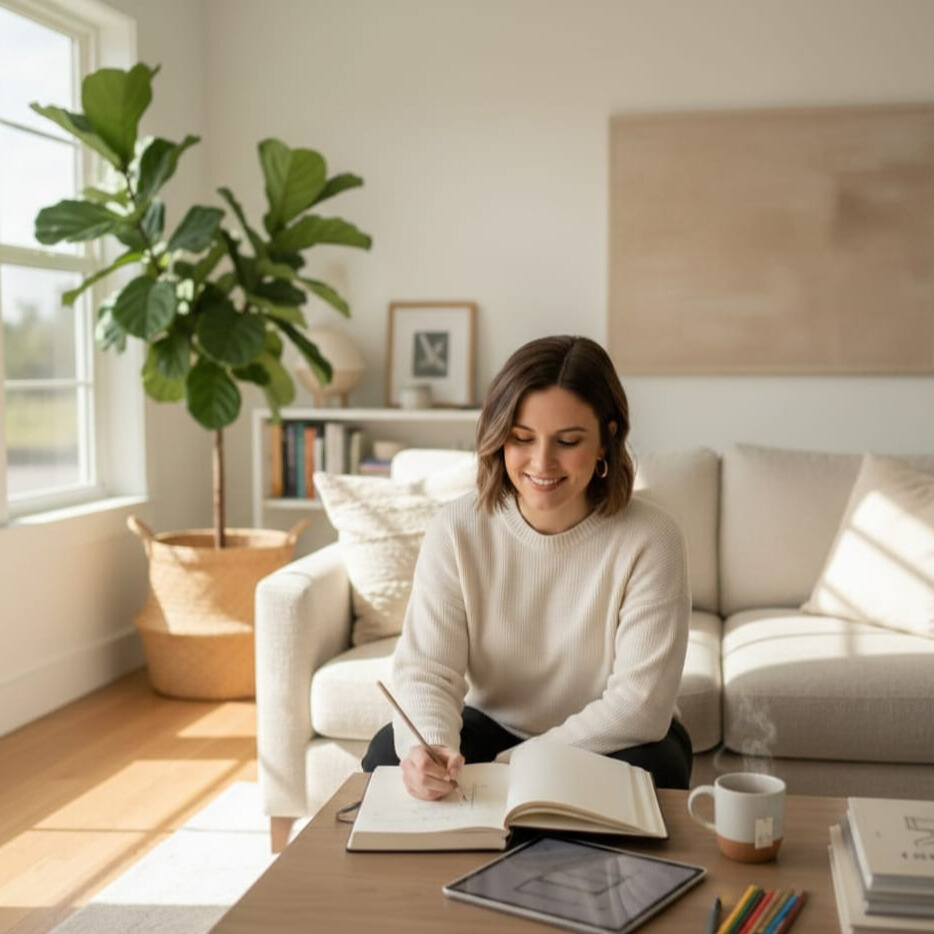
I’ve been sharing technical tips for a few weeks now, but today I want to get personal about why I’m obsessed with the 2026 color palette.
I’ll be honest: for the last five years, my house looked like a sterile doctor’s office. I fell for the “Cool Grey” trend hard, and eventually, it just felt… cold. If you’re like me and you’re tired of living in a black-and-white movie, you’re going to love the 2026 Interior Design Color Palette. We are finally moving away from those icy greys and embracing what I call “Grounded Soul.” Moreover,it’s about earthy hues, warm stones, and making your home feel like a giant, cozy hug. Whether you’re decorating a mansion or—like most of us—trying to make a tiny apartment look expensive on a “dime,” these trends are your new best friend.
Interior Design Color Palette Trends 2026: From Cold Minimalism to Warm Luxury
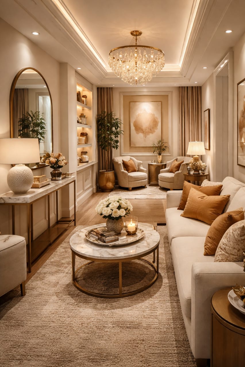
The trends for 2026 are making a massive move away from cold minimalism. Instead, we see a rise in warm, tactile luxury. To be fair, people are craving rooms that feel soft and lived in. Specifically, designers are now choosing colors inspired by soil, clay, and sand.
In addition, these colors work perfectly with natural light, and the best part of decoration. As a result, even small rooms begin to feel more open. Furthermore, this shift supports wellness. In addition, proving that Color Psychology in 2026 is really about creating a “mental pause” in an otherwise busy world.

| Design Element | Past Trend (Cold Minimalism) | 2026 Trend (Warm Luxury) |
| Primary Color | Cool Grey / Stark White | Universal Khaki / Deep Cocoa |
| Accent Color | Navy / Black | Terracotta / Earthy Moss |
| Stone Texture | Polished Marble | Honed Travertine / Limestone |
| Finish | High Gloss / Shiny | Matte / Tactile Finishes |
| Furniture Shape | Sharp Edges / Square | Organic Shapes / Curved Edges |
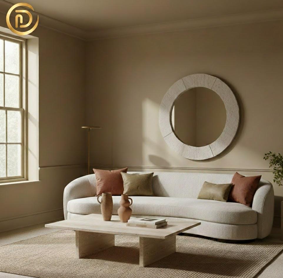
The Earthy Palette: Power Colors for 2026
New Neutrals and the 60-30-10 Rule
The new neutrals are incredibly warm and soft. Moreover, Sherwin-Williams Universal Khaki is a standout choice, and I’ve found that it works brilliantly on both walls and cabinets. Meanwhile, Benjamin Moore Silhouette adds that necessary depth; it is a charcoal-infused espresso that perfectly defines “Quiet Luxury.”
In order to balance these effectively, try sticking to the 60-30-10 rule:
- 60% Base: Use Universal Khaki for walls.
- 30% Secondary: Earthy Moss for rugs or upholstery.
- 10% Accent: In addition, Sunbaked Clay for pillows and vases.
Moody Earth Tones for Drama
Warm Mahogany and Deep Cocoa bring a rich, sophisticated feel. In my experience, these work best on accent walls or doors because they absorb light so gently. What’s more, this adds drama without making the room feel heavy. Surprisingly, these tones actually make budget furniture look expensive; for example, a simple wood table looks custom-made when set against a deep cocoa wall.
Biophilic Greens
Biophilic tones are absolutely key this year. Ultimately, Sage Green and Warm Eucalyptus create a wellness-focused home, and more importantly, they connect our indoor spaces back to nature. Meanwhile, these greens pair perfectly with warm stone textures and soft beige walls.
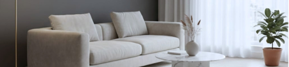
The Warm Stone Revolution: Why I’m Choosing Travertine over Marble in 2026
For years, we were told that white, shiny marble was the height of luxury. But let’s be real: in a small home, polished marble can feel cold, clunky, and a little bit “try-hard.”
In 2026, luxury is shifting toward Tactile Warmth. This is why I am officially team Travertine and Limestone. Moreover, here is my “Dimes” take on why you should make the switch:
- The “Cozy” Factor: Marble reflects light in a sharp, chilly way. Conversely, Travertine, with its tiny pits and matte finish, absorbs light. Consequently, it makes a room feel like a Mediterranean villa rather than a bank lobby.
- The Durability Myth: People think stone is hard to maintain. While marble stains if you even look at it with a glass of red wine, the organic, “imperfect” look of honed limestone actually hides small scratches and dust much better.
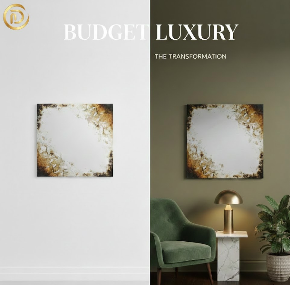
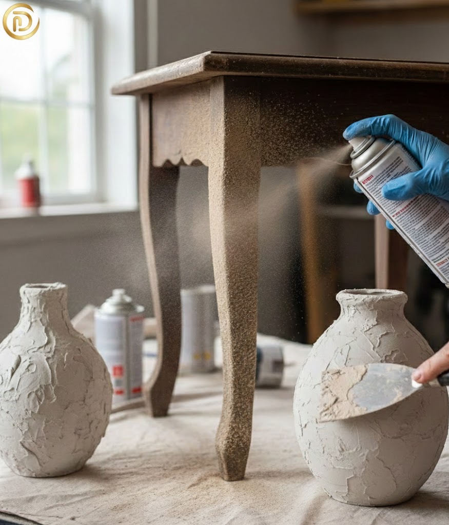
- Budget Luxury Hack: This is the best part. In short, to achieve this, high-end marble slabs are insanely expensive. However, you can find travertine pavers at local hardware stores for a few dollars. Furthermore, I’ve seen designers use these as coasters or even stack them to create a “plinth” side table. In short, it’s a “Quiet Luxury” move that looks like a million bucks but costs less than your morning coffee.
Maren’s Pro-Tip: If you’re worried about the “holes” in travertine, look for “filled and honed” pieces. Besides this, you get that gorgeous sandy color without the worry of crumbs getting stuck in the stone!
2026 Interior Design Color Palette Visualization

Budget Luxury Tips: The Designer Look for Less
Paint Drenching
Paint drenching means painting your walls, trim, and ceilings all in one color. Interestingly, this trick makes rooms feel much more intentional, almost like a boutique hotel suite. For a high-end finish, use earthy colors like Universal Khaki or Sage Slate.
The Stone Plinth Hack
You can use stone-texture spray paint on almost any thrifted furniture. Beyond just saving money, this is a great way to embrace Sustainable Luxury because you are upcycling instead of buying new.
DIY Limewash and Stone Compound
If you’re on a budget, Limewash paint gives walls a soft stone look for under $50. In addition for decor, try applying a thin layer of joint compound to a thrifted vase. Believe it or not, this gives it that “Warm Stone” grit that is essential for the 2026 aesthetic.
Hardware and Scent
Don’t forget the details regarding hardware and scent, Swap basic hardware for antiqued brass or stone-inlay knobs. Also, remember the “Luxury Scent” connection. As well as, earthy palettes look much better when they smell like sandalwood or cedar.
Seriously, don’t skip the scent. You can have a $10 thrifted vase on a $50 DIY table, but if the room smells like expensive sandalwood, especially, your guests will assume you’ve won the lottery.
Small Space Hacks: Earthy Tones in Tight Layouts
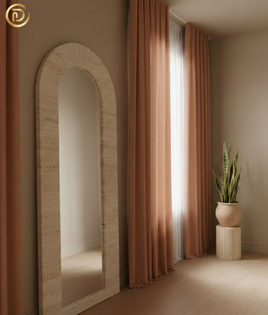
Mirror Tricks and Verticality
Warm stone-framed mirrors reflect light beautifully, and this simple addition makes small rooms feel much brighter. To take it further, use floor-to-ceiling curtains in Ochre or Terracotta to draw the eye upward and make your ceilings feel twice as high.
Organic Shapes
In small spaces, it’s best to avoid sharp edges. Instead, use Organic Shapes. You’ll find that a rounded ottoman or a curved mirror softens a room instantly. Along with this, these fluid silhouettes really improve the flow of your Living Room Layouts, making tight spaces feel less rigid and cramped.
Budget-Friendly Implementation Checklist
- Choose one earthy paint color for a “Color Drenched” look.
- Besides this, add one warm stone texture, like a travertine tray.
- In addition, swap hardware for matte brass or stone finishes.
- Introduce one piece with an Organic Shape to soften the layout.
| Luxury Item | Designer Price | Budget Luxury Alternative |
| Travertine Side Table | $800+ | Thrifted Table + Stone Texture Spray |
| Limewash Walls | $1,200 (Pro) | DIY Limewash Paint ($50) |
| Solid Stone Vase | $150 | “Stone Compound” DIY Vase ($10) |
| Designer Hardware | $25/knob | Antique Brass Spray or Inlay DIY |
Conclusion: Creating a Timeless 2026 Home
In short, the 2026 Interior Design Color Palette is all about blending earthy hues with warm stones to create a calm, inviting sanctuary. At the end of the day, luxury comes from how a space feels, not what it costs. By focusing on Tactile Finishes and Warm Minimalist Decor, you can achieve a high-end look on a total “dime.” You can also take help from our guide.
To begin, start small with paint, add those stone details, and keep the layout simple. Before you know it, your home will feel timeless and perfectly ready for the future.
Frequently Asked Questions (FAQs)
Q1: How can I use the 2026 Interior Design Color Palette in a small apartment?
A: Use a “Light Earthy” base like Sandstone to keep the space open. In addition, apply our Small Space Hacks, such as “Color Drenching,” to create visual flow. By the way, introducing Organic Shapes also prevents a small room from feeling too “boxy” and rigid.
Q2: What are the best “Budget Luxury Tips” for stone textures?
A: Focus on Tactile Finishes. In addition, use stone-texture sprays on old furniture. This supports Sustainable Luxury by upcycling. Along with this, small changes, like stone-inlay knobs. Also, add a designer touch for very little money.
Q3: How does “Color Psychology 2026” influence home design?
A: It focuses on wellness. Moreover, earthy hues and Warm Minimalist Decor are proven to lower stress. In addition, these colors create a “sanctuary” feeling. So, they help you decompress by using nature-inspired, low-arousal tones.
Q4: Where should I place stone accents in my Living Room Layouts?
A: Position “Warm Stone” items, like a coffee table or plinth, as focal points. Along with this, ensure your Living Room Layouts have enough clearance for flow. For more tips, visit our Living Room Layouts page to learn about the “golden ratio” of furniture placement.