
I. The Hook: The 2026 New Neutral Revolution
Leopard print as a neutral sounds surprising at first. Still, once you look closer, it makes perfect sense. Leopard is not just a pattern. Instead, it is a mix of warm earth tones that already live in most homes. When styled the right way, it blends in just like beige, camel, or soft brown.
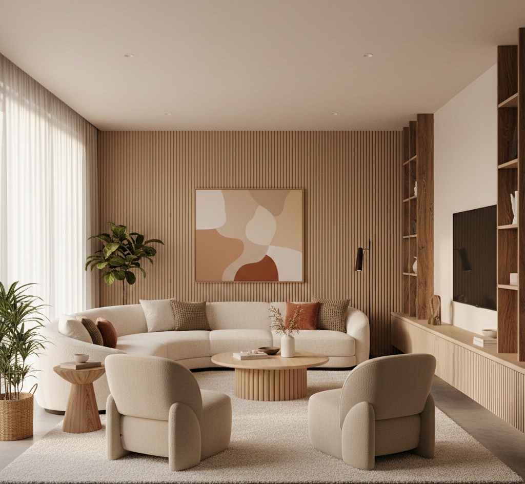
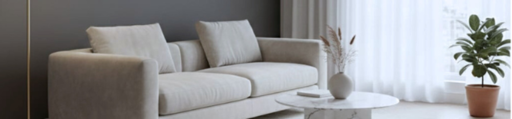
In 2026, interior design is shifting toward textured neutrals. Homeowners want spaces that feel calm but layered. Because of that, designers are pairing Cloud Dancer white walls with Mushroom Gray sofas and subtle animal prints. Leopard fits perfectly into this movement. In addition, it adds depth without adding noise. It also brings warmth without feeling heavy.
For renters and homeowners on a budget, leopard print as a neutral is a smart choice. It gives character while still working with minimal furniture and simple layouts. In this article, you will learn how to use leopard print as a base neutral in a way that feels refined, modern, and affordable.
II. Why Leopard Print as a Neutral Feels Like Quiet Luxury
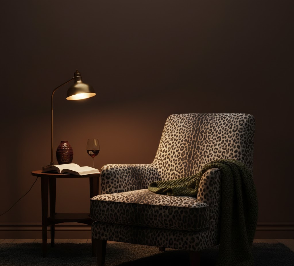
Leopard print as a neutral works because of simple color math. Most classic leopard patterns are made of about sixty percent camel, thirty percent black, and ten percent cream. These colors already appear in wood floors, stone counters, and woven textiles. Because of that, the print feels familiar rather than loud.
Quiet luxury is about pieces that look rich but never try too hard. Leopards do that naturally. The organic spots are uneven, just like marble veining or wood grain. As a result, the eye reads it as texture instead of decoration. This explains why sophisticated ways to style leopard print often feel calm rather than bold.
There is also a psychological effect. Moreover, natural patterns make a room feel grounded. They soften sharp lines and smooth out empty spaces. When paired with textured neutrals and a tonal palette, leopard becomes part of the background. This approach is a key part of leopard print interior design trends 2026 and fits perfectly with warm minimalism.
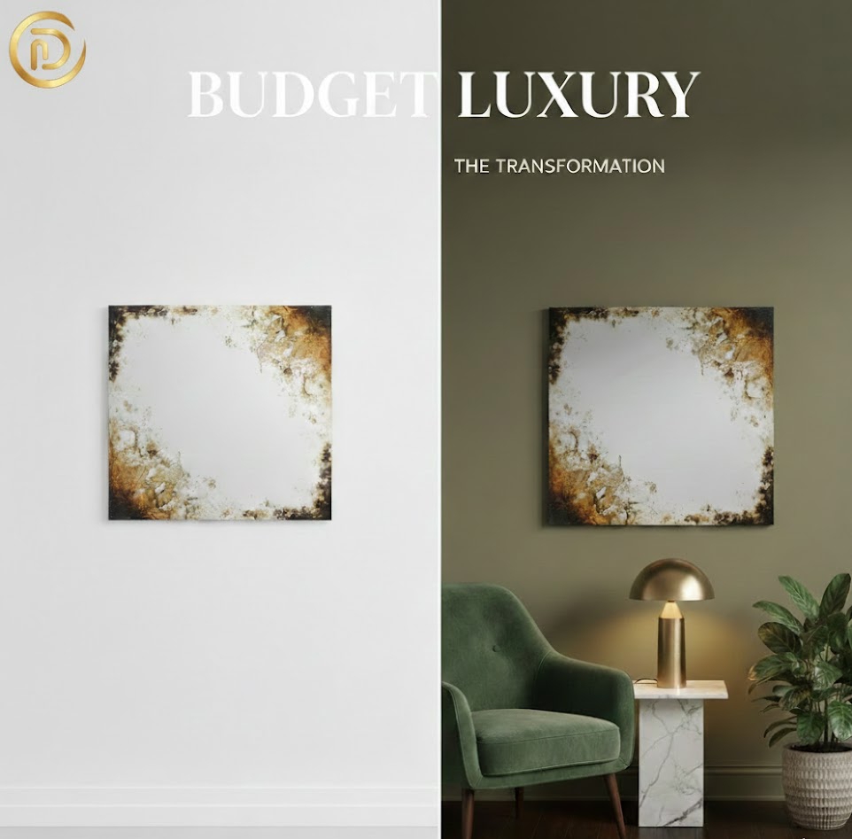
Quick Guide: Achieving the Leopard Print Neutral Look on a Budget
| Luxury Element | Budget Hack | Impact |
| High-End Wallpaper | DIY Framed Leopard Silk Scarves | Adds Vertical Height |
| Designer Silk Rug | Low-pile Synthetic over Jute | Grounds the Layout |
| Bespoke Metals | Matte Black Spray Paint | Modernizes Accents |
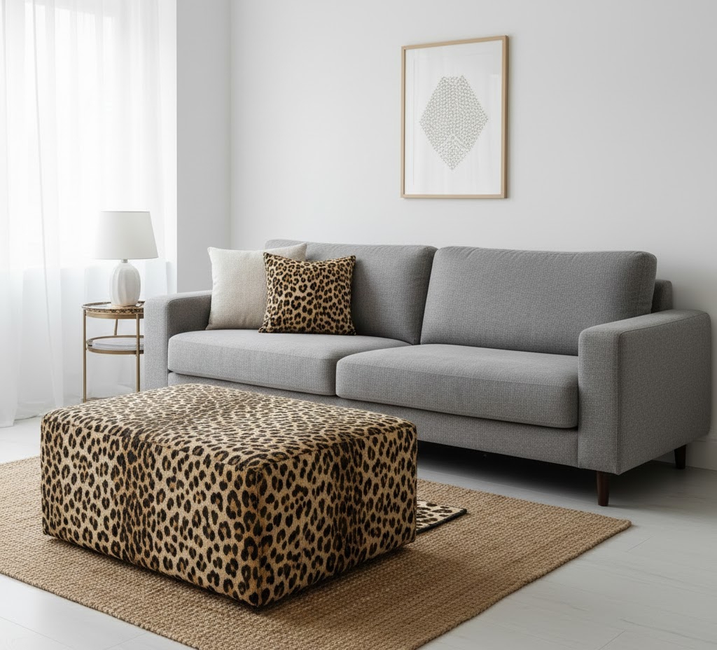
III. Way One: Leopard Print as a Neutral With the Grounding Rug Strategy
Using Leopard Print as a Neutral on the Floor
One of the easiest ways to try leopard print as a neutral is with a rug. In addition, low pile leopard rug works like a base layer. It anchors white sofas, boucle chairs, and light wood tables. Instead of stealing attention, it holds the room together.
Budget Friendly Implementation
To save money, start with a large jute rug. Then, layer a smaller leopard rug on top. This creates a designer look for less. The jute keeps the space natural, while the leopard adds interest. This leopard print area rug styling trick works especially well in apartments.
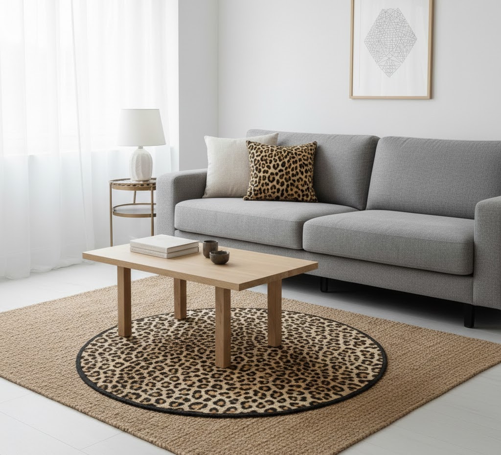
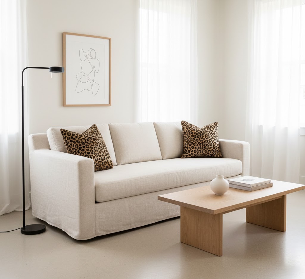
IV. Way Two: The 15% Rule for Leopard Print as a Neutral
Controlling Visual Balance
When using leopard print as a neutral, less is still more. Designers often follow the fifteen percent rule. This means leopard should cover no more than fifteen percent of what you see in the room. Because of that, it feels intentional and clean.
Modern Leopard Print Living Room Tips
In a modern leopard print living room layouts, try ottomans, benches, or throw pillows. As well as, these pieces add depth while keeping the layout open. In small spaces, this matters even more. Instead of cluttering the floor plan, you add layers at eye level and seating level.
This is one of the most sophisticated ways to style leopard print, especially for renters who need flexible decor.
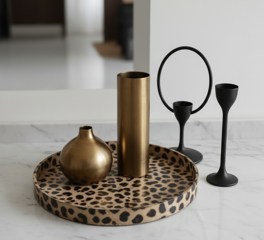
V. Way Three: Metallic Pairings That Make Leopard Print Look Expensive
Leopard Print as a Neutral With Matte Metals
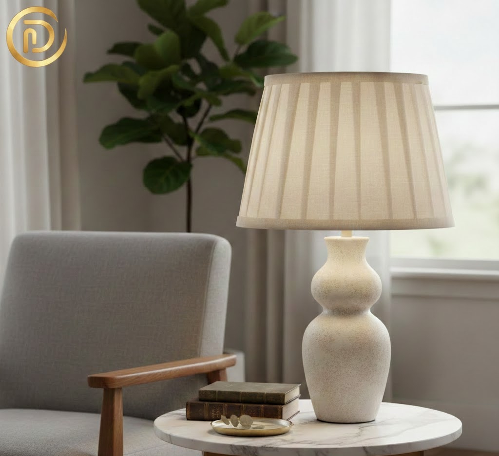
If you want to know how to make animal print look expensive, look at the metals around it. In 2026, glossy finishes are fading out. Brushed brass, aged bronze, and blackened steel feel softer and more refined.
When leopard print as a neutral is paired with matte metals, it instantly looks intentional. Table legs, floor lamps, and cabinet pulls all matter. These finishes calm the pattern and connect it to quiet luxury interior design trends 2026.
Parisian Chic on a Budget
Keep the rest of the room simple. Neutral walls, clean lines, and soft lighting allow the leopard to blend in. This approach works well in dining rooms and bedrooms where you want elegance without excess.
VI. Way Four: Vertical Interest Using Leopard Print as a Neutral
Wallpaper and Art That Feel Subtle
Vertical surfaces are often ignored. However, they are perfect for leopard print as a neutral. Tone on tone leopard wallpaper in powder rooms or entryways adds height and texture. Because the colors stay soft, the print feels calm.
Affordable Art Ideas
For a budget friendly option, frame leopard print silk scarves. Moreover, choose muted tones and simple frames. Hang them in a row for a gallery look. In addition, this trick adds personality while staying within a chic home styling mindset.
Vertical placement also keeps the floor clear. As a result, small rooms feel taller and more open.
VII. Way Five: Dark Moody Layers With Leopard Print as a Neutral
Pairing Leopard With 2026 Color Trends
Leopard print as a neutral looks especially rich when paired with darker shades. Also, chocolate brown, merlot, and deep olive are leading colors in 2026. In addition, these tones calm the print and make it feel grounded.
Creating Depth Without Noise
Dark walls or accent furniture reduce contrast. Because of that, the leopard blends in instead of standing out. This approach works well in bedrooms and offices where you want a cozy mood. It also fits both maximalist accents and warm minimalism when done carefully.
This explains why sophisticated leopard print decor often leans darker rather than brighter.
VIII. Budget Friendly Implementation Checklist
To keep your space affordable and polished, focus on these steps.
- Choose one leopard piece per room
- Stick to warm, muted color palettes
- Layer textures like wood, linen, and wool
- Use matte metals instead of shiny finishes
- Keep furniture lines clean and simple
These budget luxury home decor tips 2026 prove that style does not need to be expensive. It just needs to be thoughtful.
IX. Conclusion: Why Leopard Print as a Neutral Works
Leopard print as a neutral is not a trend built on shock value. Instead, it is based on balance, texture, and color harmony. When treated like a textured neutral, leopard brings warmth and depth without overpowering a room. In addition, this mindset is the real budget luxury secret.
If you enjoyed these ideas, visit our About page to learn more about Decor in Dimes. Also, explore our Small Space Hacks for more ways to create high end style on a smart budget.
Frequently Asked Questions
1. Is leopard print still in style for 2026 home decor?
Absolutely. In 2026, leopard print transitioned from a “trend” to a “classic neutral.” The current shift focuses on Quiet Luxury, where leopard is used in high-quality textures (like velvet or wool) and paired with minimalist furniture to create a sophisticated, timeless look.
2. How do I make leopard print look expensive and not “tacky”?
The secret to a high-end look is the 80/20 Rule. Keep 80% of your room in solid, matte neutrals (like cream, charcoal, or camel) and limit the leopard print to the remaining 20%. Avoid shiny, cheap synthetic fabrics; instead, opt for matte finishes and organic textures that mimic natural fibers.
3. Can I use leopard print in a small living room?
Yes! This is one of our favorite Small Space Hacks. Because leopard print contains multiple shades (tan, black, cream), it adds “visual depth” to a room, making the walls feel further away. Use it vertically—such as in floor-to-ceiling curtains—to draw the eye upward and create the illusion of higher ceilings.
4. What colors pair best with leopard print for a luxury vibe?
For a “Budget Luxury” feel, pair leopard with metallic accents like brushed brass or blackened steel. If you want a pop of color, the 2026 favorites are Deep Emerald, Merlot, and Burnt Sienna. These jewel tones ground the animal print and make it feel intentional and designer-led.